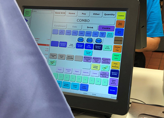
Point-of-sale (POS) interfaces are increasingly consumer facing. No longer limited to employee use, the customer often places their own order. Or, if the order is entered by the employee, the customer frequently sees a more detailed order summary than has traditionally been presented. On a recent office field trip to a nearby fast food restaurant, we noticed something odd (see the picture below): At the order counter, there was a screen opposite the employee screen. While that was not unusual, what was unusual was that the screen reflected the exact POS the employee uses! This may be an attempt at transparency to show the customer what they’re getting, but for the most part, this just serves to confuse. As a customer, am I supposed to be clicking buttons? What do all these buttons and acronyms mean? And why am I seeing this?

Actual customer-facing screen
By the way, our team could not resist trying to touch this screen (nothing happened).
The customer POS
It goes without saying that all POS interfaces need to be easy to use and efficient, regardless of whether the customer is passively presented with an order summary or is actively inputting information. In the case of the former, the customer should be presented with a visually simple order summary that facilitates quick and easy scanning to ensure the order is accurate, prices are correct, etc. Ideally, the display should be free of jargon that is used internally by the (e.g.) kitchen. For example, the summary should say “Extra pickles” and not just “++PKL.”
While it is good to be transparent and let the customers know exactly what they are ordering, this sense of transparency should not come at the expense of information overload. If the order is being taken for the customer, they do not need to see every possible combination of how a drink could be ordered; they just need to see that they ordered a Large Coke and the associated price.
In this same vein of avoiding information overload, if the customer enters the order, they need to have fewer features. For example, the interface may not have cash available as a payment method, or not having the option to enter promo codes if they can’t do it without manager intervention, and a more step-wise approach to ordering. The customer-facing interface also needs to be far more graphical, visually pleasing, and branded. McDonalds and Panera do this well for their in-store customer order interface; Buffalo Wild Wings and Domino’s are particularly good on the mobile app front.
The employee POS
On the other side of the counter, the employee (or expert) view of the POS interface does not necessarily need an exceptional visual design; functionality and efficiency must be prioritized. The design of an expert user interface needs to prioritize completing the task as quickly and effectively as possible; to this end, many of the flashy design elements are stripped away so that multiple features, both basic and more advanced functions, are at the forefront. It may need several functions a customer would not need if they were inputting their own order – ability to accept cash, enter promotional codes, etc. on a single screen.
If you’re like me and needed manager-intervention during the self-checkout process at the grocery store, then you’ve seen the “employee-view” of the self-checkout system. It looks vastly different than the customer-facing interface. It’s generally stripped of the store’s branding, packed with more features on a single screen, and offers the types of functionality that only an employee would need.
Regardless of whether the interface is intended to be used by a customer or an employee, the key is to ensure that the POS interface is right for the intended audience. The only way to accomplish this is user testing. From early concept testing through final summative testing, collecting user input and implementing this feedback will result in a happy and satisfied user.
